Minimal Focus

The minimal design aesthetic is popular and often requested by clients. It’s the process of reducing a design down to only the most essential elements.

Its success depends on the ability to…

– Focus the brand to its core

– Remove elements that do not add value

– Reinforce the brand message through strategic design

Brands commonly assume that it is…

– Easy to accomplish

– The result of a good designer

– Available without a clear strategy

A successful minimal design is only a reflection of a brand who knows who they are, it is not solely the result of a good designer. A minimal design for a brand that only has minimal focus is nearly impossible to achieve.

Commentator

Our product, service or idea can be phenomenal, and people will still have their opinion. There will always be a commentator, and their role is to comment, even when it doesn’t seem necessary. Inevitably, someone will believe the design is subpar, that the experience could be better, or idea isn’t original.

The commentator is not the problem, it’s when we follow the destructive path of believing in unjustified critiques. Most damaging, is when we create or take action with the voice of the commentator leading the way.

Instead of creating for the commentator, create from your inspired self and know that the commentator will always be there. Remembering that the most critical commentator can be the one within ourselves.

Why The USPS Should Have Made Babies A Brand Priority

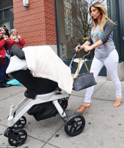
I was in New York recently and had to do a double take when I saw a USPS mail carrier delivering mail. The mail was being maneuvered through the streets using a device that greatly resembled the popular product design of the luxury baby stroller–

  • Two bigger wheels in the back that sit on a wider frame.
  • Two smaller wheels in the front that sit on a narrow frame.
  • Ability to house precious cargo safely.

mail carrier article-2637712-1E2CB48B00000578-796_634x754

Could baby strollers have been the answer to the USPS’ financial crisis?

The mail carrier device and the baby stroller have similar functions and design. I’ll argue that the mail carrier has an even better design. The way the front wheel frame curves in the front, and the ratio in size of the front and back wheels, look vintage (An important aspect of the current luxury product offerings.) The mail carrier, unlike the baby stroller, uses one handle and gives the handler more flexibility with a free hand.

Part of discovering a great product idea is noticing where these kind of parallel’s exist. When needed functionality and good design exist in one place, chances are they may fill a need somewhere else.