Create for yourself first

There are always solutions that we need to put in place for our life. Many of those solutions may be things that have been resolved by someone else, giving us viable options to choose from. However, there are times when there is no solution to the problems we face, and that is where the potential for a good product idea exist.

Take inventory of your life and daily routines to recognize opportunities for needed solutions. Chances are that someone else is bumping against the same issue. Creating for ourself first is the best way to develop a good and relevant idea.

What feeds a good idea?

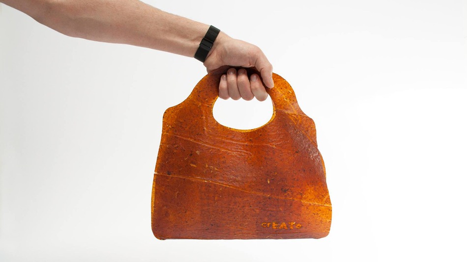
Students studying and graduating at the Willem de Kooning Academie in Rotterdam created a process that converts leftover fruit and vegetables into durable, leather-like material.

fruitleather-thumb

The students state that “In this project we created a solution for one of Rotterdams biggest social issues, food waste.”

While many people realize that food waste is an issue on a global scale, I am curious what factors supported the growth of this idea, from this particular group? There are a few key components that may contribute to this:

1. Collective: This group describes themselves as a collective of designers. The truth is that a group is much more powerful than the glamorized solo designer.

2. Solution based: The idea was focused on the solution rather than the consumer. They sought out a solution to an issue relevant to their environment and experience.

3. Environment: The students are part of an environment that invites and supports experimentation. Where mistakes are seen as a vehicle toward a workable solution rather than a liability.

All around us, there are several issues that could benefit from similar workable solutions. The question is, are we creating an atmosphere that feeds good ideas?

Turn it up

While streaming music online I commonly turn up the volume on songs I really like. It’s a habit that automatically happens, whether the volume is at its max already or not. If the song is a long time favorite, it takes me just a few seconds to complete this action. For newer songs, the action usually happens mid-way through the song.

Observing this habit made me think, wouldn’t my experience be improved if the music streaming service accounted for these actions? This feature enhancement could boost my music selection by accounting for this typical human interaction.

Algorithms could be created within the music streaming software so that…

– Songs I turn the volume up on would be treated as a favorite.

– The volume could automatically adjust back to a neural volume after a favorite song has completed.

– It may be possible to account for the level I like a song, based on how long it takes me to turn up the volume.

Accounting for human behavior can help us identify new ideas or envision ways to enhance already existing ideas.

What do you do when a song is really good? I turn it up.


I’ve written a few articles on the music streaming industry (follow the links below to read). The perceived competition between Spotify, Pandora, Apple Music, and Tidal, has captured my attention.

6.29.2015: Apple ignites human potential with the launch of Apple Music

6.30.2015: How a brand can have the best product or service and still lose

7.2.2015: Be yourself, it’s the reason we showed up in the first place

8.6.2015: Selling sound

Piece of cake

We can learn a lot from cake. The other day I observed the minimal action received by a dessert counter inside a local coffee shop. Maybe the lack of interest was due to the discipline of so many people…..or maybe not?

There seemed to be a few factors at play…

Slice of cake: Most of the cakes were untouched. Few people want to be the first to purchase the first slice of cake.

Passing through the line: Dessert goers and non-dessert goers pass through the same line. If several people pass through without succumbing to temptation, someone following may feel they can as well.

Smell: The smell of coffee and espresso overpowered the sweet aroma of the desserts.

In comparison, why does the dessert shop or the separate dessert counter in stores seem irresistible?

Discipline: It makes us feel disciplined. If there are hundreds of desserts on display, you seem like a warrior for only taking one.

Separate line: Everyone who makes a trip to the dessert counter is interested in the sugary treats on some level, even if it is only to stare and salivate.

Smell: The concentrated smell of desserts and fresh pastries are hard to resist.

Questions to consider…..

How do we optimize the presentation of our idea? Will different environments influence how people engage? How are decisions being influenced? And are we making the experience a piece of cake?

Selling cleverness

Recently, I dined at a restaurant that served mashed avocado. Somewhat intrigued by this distinguished name for guacamole, I ordered. When the dish arrived, there was slight disappointment to discover that while a bit more pricey, it was just plain old guacamole.

The definition for guacamole is:

gua·ca·mo·le
noun
  1. a dish of mashed avocado mixed with chopped onion, tomatoes, chili peppers, and seasoning.

You can give an old product a new name or color and sell it as an original. The risk you take is engaging people who are looking to buy into a new idea, when all you’re selling is cleverness.

When is mashed avocado a new experience and when is it really just guacamole?

A new product idea for the juicing industry

Have you ever made a juice and added a red beet? It turns the entire thing red. Upon realizing that even the smallest amount of red beet would collide with the colors of carrots and greens, turning it a “rusty” color, I started to wonder….

Do juicing companies consider color when creating their combinations?

I’ll let you be the judge.

juice-colors

Then I thought….

Maybe there is a market for a rusty juice. One similar to the juice we make at home. What would that look like?

Name: Rusty Juice

The name would be a constant reminder that our juices combine all the things that are good for you.

Tagline: All the good stuff. 

The tagline would play on the idea that it’s not about what it looks like, it’s about what’s good for you.

Packaging: Darker tent bottles. Caps and labels would be color coded.

Create a “frontier” look – For the rebel who doesn’t follow the pack.

Market Advantage: Committed to people who want to have the healthiest juice available, not the prettiest.

Pros: There is a market of people willing to sacrifice pretty colors for the healthiest juice combinations.

Cons: The bright colors of competitors are attractive.

Would you buy Rusty Juice? 

Apple ignites human potential with the launch of Apple Music

Apple ignites human potential with the launch of Apple Music by accounting for human behavior in relationship to technology. 

They seem to know that…

  • Focus amplifies connection.
  • It is useful for people to know that humans built this.
  • Users will respect you for making them look smart.

Let’s look at each point in greater detail:

Focus  We are drawn to images, and size does make a difference. Let’s consider the original movie stars. It’s reasonable to argue that they were highly infatuating figures because fans only saw them on movie screens where they literally appeared larger than life. It’s more difficult to create a significant “awe” effect when viewing a person from a screen the size of a tablet or smart phone. And with the Apple Watch, size is even more of a consideration. 

Screen-Shot-scree-sizes

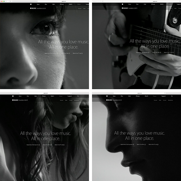
So how do artists amplify human connection when the masses are viewing them on smaller screens? Apple accounts for this by creating a greater focus on the subject. There seems to be no coincidence that the presentation of Apple Music on the website is built around closeups that maximize screen space, allowing the subject to appear as large as possible. The use of black and white filters, soft focus, and clean backgrounds are photo/video treatments that reduce distraction and focuses attention. This heightens the “awe” experience across screen sizes, increases our attachment to what we’re viewing and amplifies human connection.

apple-music-image-closeups

Humans built this – As humans, we want connection. And although we’re more connected than ever, we can still notice when a computer just doesn’t understand the nuances that are involved with our taste. Apple Music invites real humans to the forefront of the platform. From human aggregators that help with music playlist or a 24/7 radio station with live DJ’s, Apple want’s you to know, humans built this.

Apple DJ

Smart – Making products intuitive can give users a sense of ownership. If something is in tune with our behaviors, there is a belief that we were considered as part of the process. The smartness of Apple Music starts to reveal itself during the initial song selection process. Users may get a sense that the service was designed especially with them in mind when they are instructed to:

Tap once on the artists you like, or twice on the ones you love. Press and hold the ones you don’t.

apple-smart

Understand, it’s not about technology. It’s about the human experience in relationship to technology – Apple knows this.

Luxury brands are for rookies, Apple is a commodity

When someone says the word “watch”, do you think of Apple? If you don’t yet, chances are you will eventually. Don’t worry….that’s just the way things have to be. And it’s part of Apple’s strategy towards becoming a commodity brand.

To make this work, Apple needs a few things to come together (Read full details below):

[icon image=”fa fa-check” size=”tiny” url=””] [/icon] Access to a market that is on the decline and vulnerable to domination by a new vision.

[icon image=”fa fa-check” size=”tiny” url=””] [/icon] A move away from the “i” naming system.

[icon image=”fa fa-check” size=”tiny” url=””] [/icon] An iconic brand and logo.

[icon image=”fa fa-check” size=”tiny” url=””] [/icon] World domination.

Let’s review Apple’s website to help support this theory in real-time.apple-watch-pannsy1) apple.com/watch – Analytics 101, when do you exclude your full product name from the url? When you use the name you want to own.
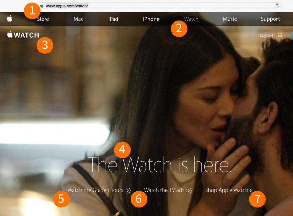
2) Watch – The website tab is just Watch.

3) WATCH – Let’s just say it’s more effective to use the visual  vs. the word Apple.

4) The Watch is here. – This is a more subtle use…but, they didn’t say the “Apple Watch” is here.

5 – 7) Even though it seems unnecessary, all the descriptions here include a common word, you guessed it, Watch.

This is all more than cleverness, coincidence, or a good idea. In the words of Apple; the Watch is here.


Here is a description of the points above.

Access to a market that is on the decline and vulnerable to domination by a new vision – Want to grow your brand? Find an industry that can use a product or service aligned to your core strengths.

A move away from the “i” naming system (iPod, iPhone, iPad, etc.) This was a move that had to be made. The market is overwhelmed by the imitators trying to cash in on Apple’s glory. For example, there are several instances of iMusic in existence that do not have any relation to Apple. Not to mention, the Apple name is golden.

Iconic brand and logo – Maybe the tipping point was the coveted sticker given away with new Apple products? While watching an old episode of Sex and the City years ago, there was a scene where Carrie Bradshaw was typing on her MacBook and the Apple logo appeared upside down? This stood out to me at the time, so I watched to see if Apple would correct the oversight. Apple has since flipped the logo so it appears right side up when in use. Sounds like a small thing, but with the trend of people working feverishly from MacBooks all over the world, it mattered. All that to say, strategic placement of the logo, it’s size and color is well thought through, and Apple is reaping the rewards.

World domination – How close in proximity are you to the Apple logo or an Apple product right now?
 

Why The USPS Should Have Made Babies A Brand Priority

I was in New York recently and had to do a double take when I saw a USPS mail carrier delivering mail. The mail was being maneuvered through the streets using a device that greatly resembled the popular product design of the luxury baby stroller–

  • Two bigger wheels in the back that sit on a wider frame.
  • Two smaller wheels in the front that sit on a narrow frame.
  • Ability to house precious cargo safely.

mail carrier article-2637712-1E2CB48B00000578-796_634x754

Could baby strollers have been the answer to the USPS’ financial crisis?

The mail carrier device and the baby stroller have similar functions and design. I’ll argue that the mail carrier has an even better design. The way the front wheel frame curves in the front, and the ratio in size of the front and back wheels, look vintage (An important aspect of the current luxury product offerings.) The mail carrier, unlike the baby stroller, uses one handle and gives the handler more flexibility with a free hand.

Part of discovering a great product idea is noticing where these kind of parallel’s exist. When needed functionality and good design exist in one place, chances are they may fill a need somewhere else.